Zealery - UX Case Study
A virtual runway shopping experience
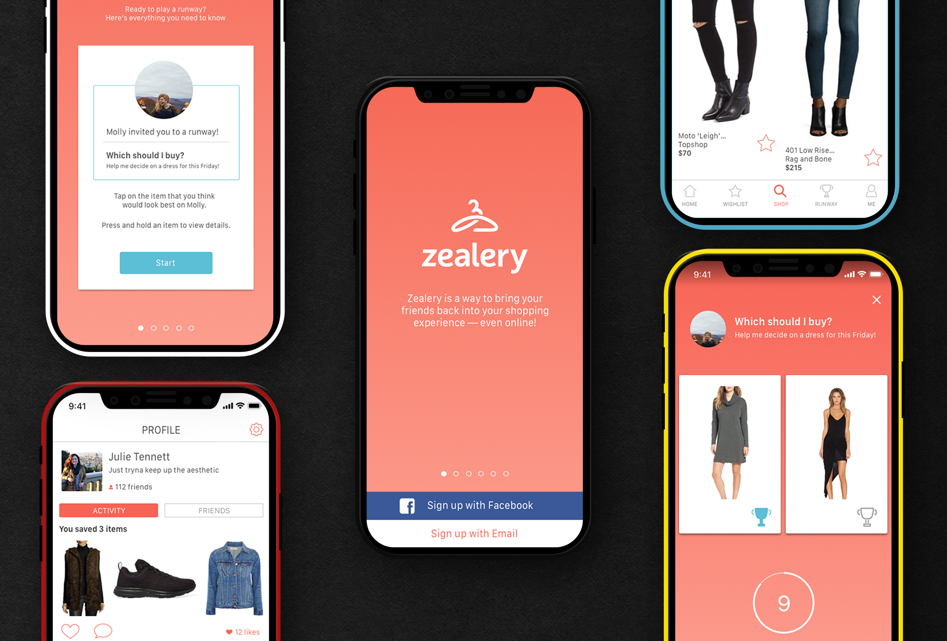
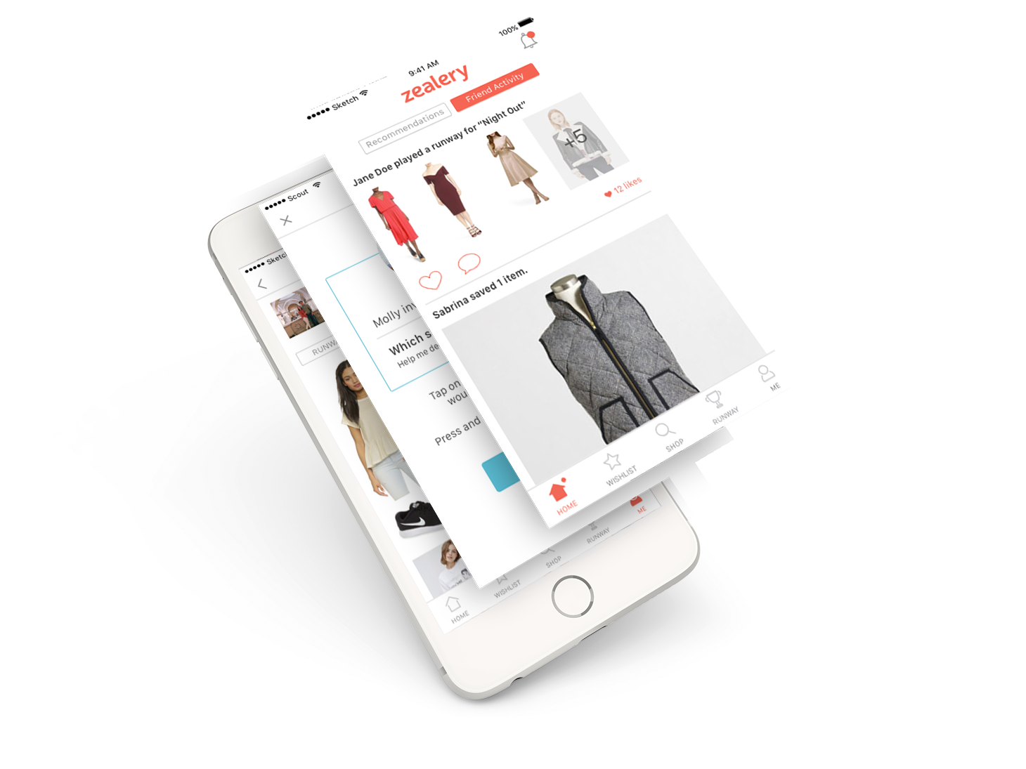
The Zealery app captures a feeling—the thrill of a mall trip with friends, now in the palm of your hand. Zealery is an e-commerce app with a social aspect, allowing users the feeling of shopping with friends in a world that have shifted from window shopping to virtual shopping.
My Role
Studio Designer @ Scout
Team
Christina Allan
Juliana Tennett
Kevin Casas
Sabrina Kantor
Project Type
Mobile UI/UX
THE CHALLENGE
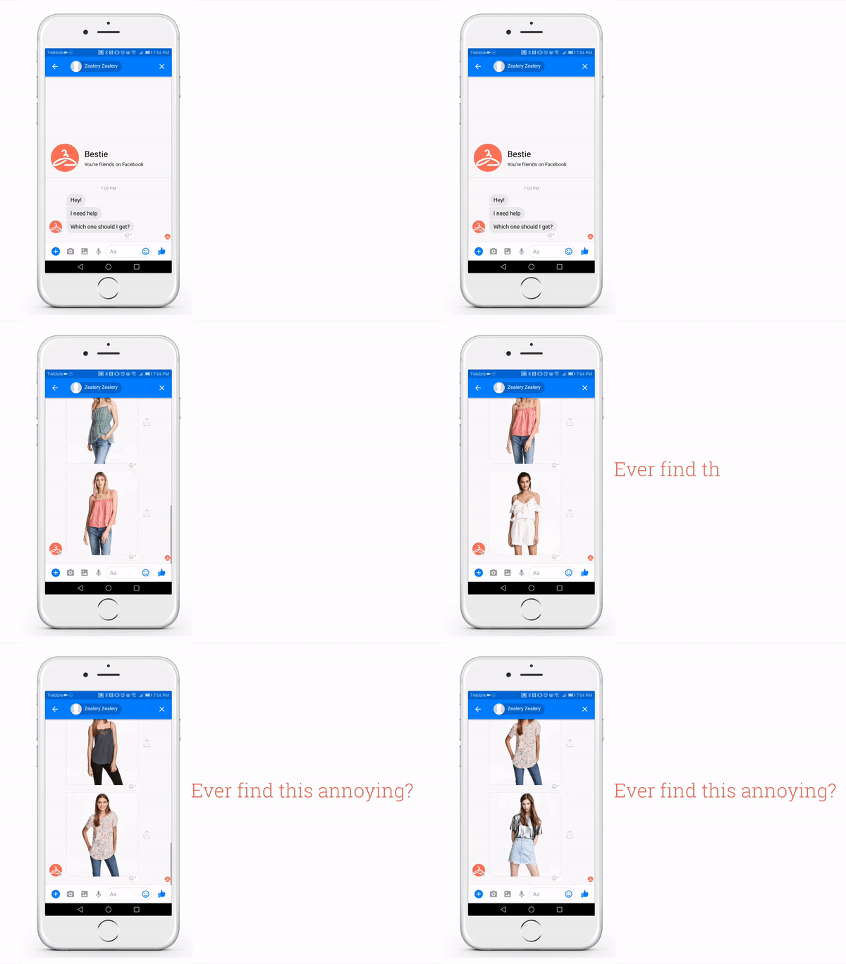
Shoppers online already create wishlists, bookmark pages, and load their shopping cart online to share images in group chats or over existing social media platforms. They share to seek opinions, recommendations, and approval from their social circles before purchase.
The ambition is to create a social platform that can tie all these elements that contribute to the experience of online ‘social shopping’ and deliver it back to our users in a form of a mobile application.
We’re going to identify this feeling, and face the question: how can we bottle it and deliver it back to users in the form of an app? We’ll strip Zealery down to it’s core and reassemble it, while learning which features our audience is most interested in. In tandem, we will outfit Zealery and all of it’s components with a brand that resonates with users.
DEFINING OUR GOALS
1
Social
Embody the feeling of shopping with friends in a social app platform.
In an era of online shopping, shoppers can purchase an entire wardrobe from the comfort of their own living room or while waiting in line for coffee. The human desire for social interaction and feedback, however, has not disappeared with shopping in person. We aim to create an experience that fulfills the human desire for social shopping trips tailored to the way we are shopping in the age of smartphones.
2
Ease of use
Design a platform that allows for effortless decision-making.
The existing ways that friends share potential purchases with one another are clunky and involve many steps. In a group message, it is possible to come to a decision or one member sends a photo, but it may take many messages, and stray from the conversation at hand. We want to design a platform that streamlines the sharing process and keeps the focus on making an informed shopping decision in an effortless way.
3
Personalization
Create an experience that feels unique to each individual and allows for the discovery of new items.
Shopping online forces shoppers to browse entire categories; if in search of a dress, one might have to look at ten or more dresses before seeing one that they would even be motivated to click into. Using machine learning, we want to create an experience that feels as personalized and unique to users as shopping in person, where they may not browse the whole store, but head directly to the styles that fit their established style. In a similar way, by learning about a user’s style, we want to present to the user related items and brands that may pique their interest.
PROTOTYPING AND DESIGN
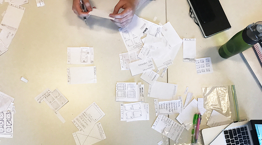
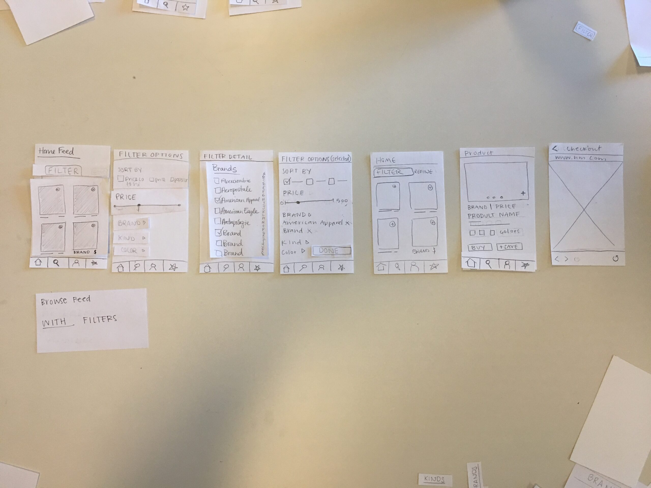
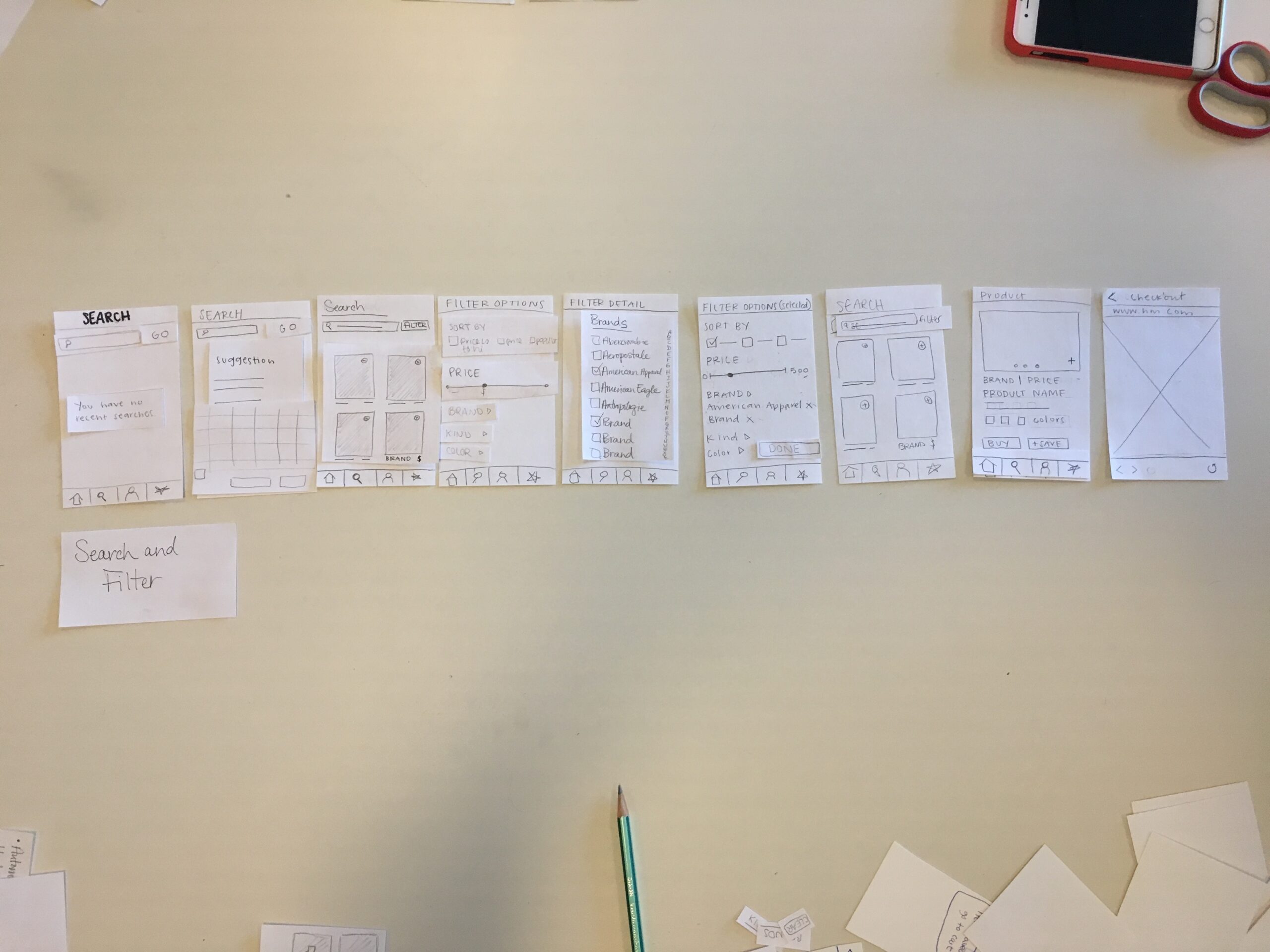
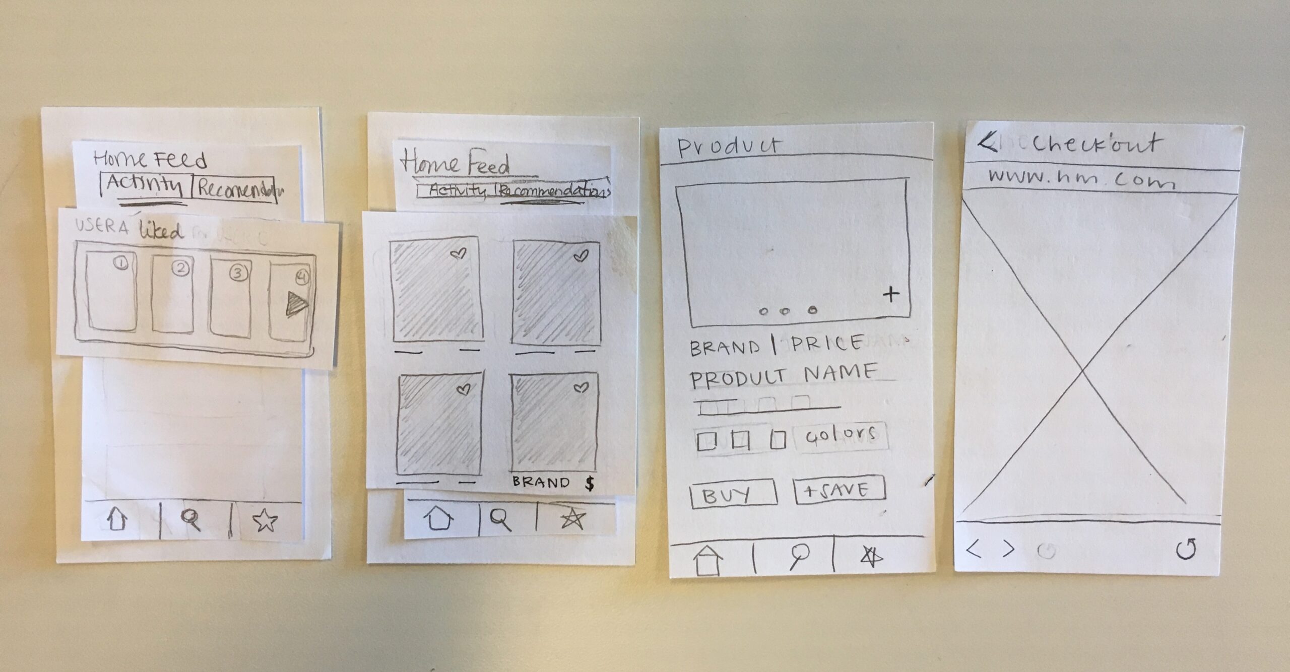
As the team began to wireframing process, we found that paper prototyping worked effectively during brainstorming and collaboration sessions. The team was able to make effective UX decisions on user-flows on paper prototypes as it facilitated the necessary conversation, input, and debate from the team to advance each flow. It allowed us to critique different solutions to best tackle each user story and quickly throw ideas together in a collaborative setting. Once the flows were finalized, we moved into translating the paper prototypes into clickable lo-fi wireframes for testing. The lo-fi fidelity, made on Balsamiq, forced both testers and the team to focus less on the visual fidelity of the screens but on the flows and functionality first.
BRAND IDENTITY DESIGN
It was important to create a brand for Zealery that would shape the way we designed the UI. Our lowercase cursive Z evolved into the Zealery hanger, and we pieced together typefaces that served as inspiration for the completely custom Zealery logotype. The coral color was one that the team and the clients liked from the beginning, and we later added the teal to differentiate the runway feature, the section of the app that required the most thought and iteration.
The Outcome
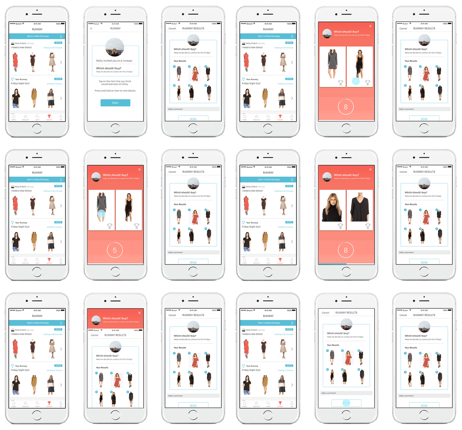
The Ruway
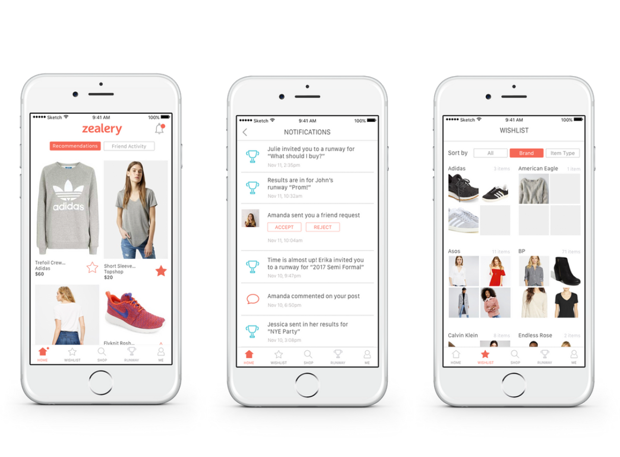
Home and Wishlist
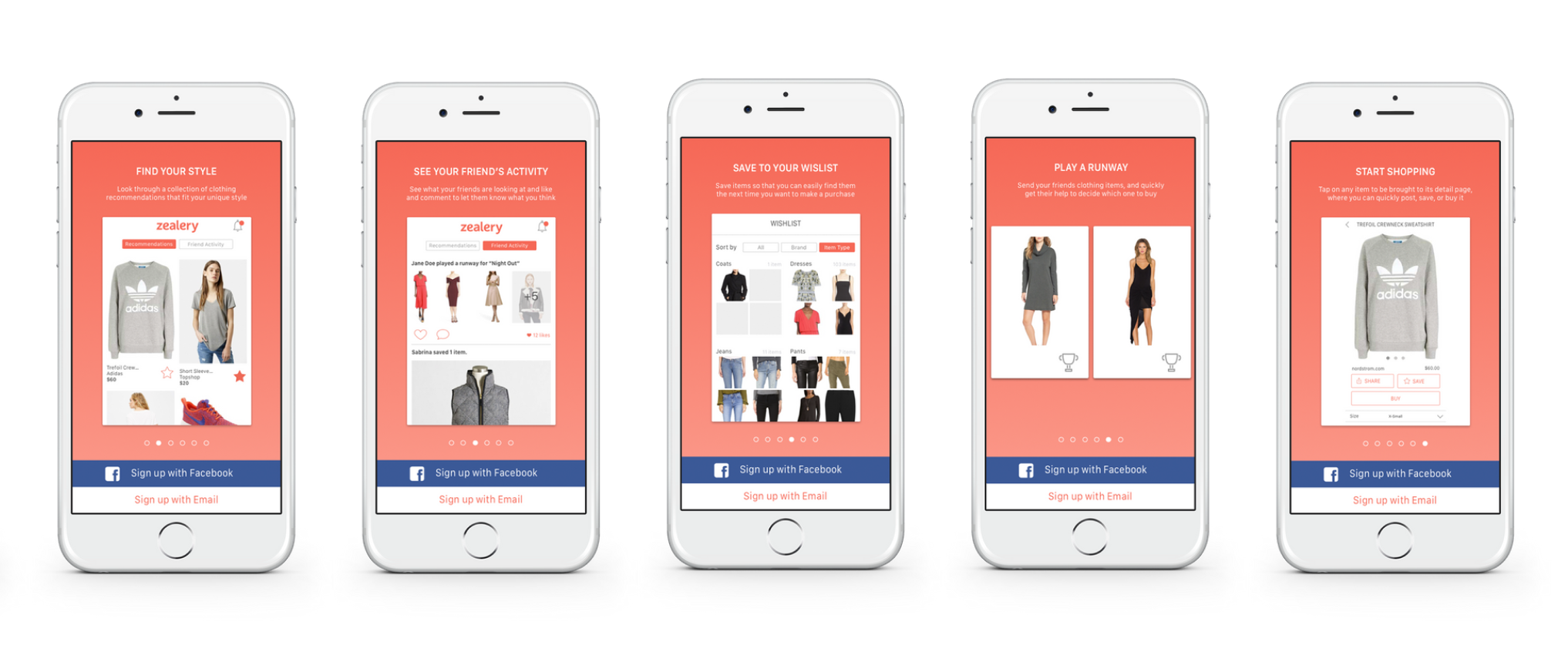
Onboarding Experience
Lights, runway... action?
Startups are hard. In Jan 2019, Zealery shut down. However, the app managed to make it to a small number of users through an iOS app store release. I'm proud of the work the team did and grateful for the opportunity to work with Wentao and the founders at Zealery. Thank you to the talented team of designers at Scout and big thanks to Sabrina, our dedicated front-end developer who worked tirelessly to bring the Zealery product to life.